Home Warranties
Made Easy
Client
American Residential Warranty
Agency
Thrive Agency
Role
UX/UI Design Lead
Deliverables
Branding
UX, Visual and Interaction Design
Social Ad designs
This is a project of Thrive where I got involved from the initial phase as a Lead Designer. ARW is a company who provides insurances for home appliances. They came to us for getting help in branding and setting a brand voice digitally as their current presence did not have enough visual language. They are one of the biggest cliet’s for Thrive. I had a great opportunity in setting a design language from scratch.
Stylescapes
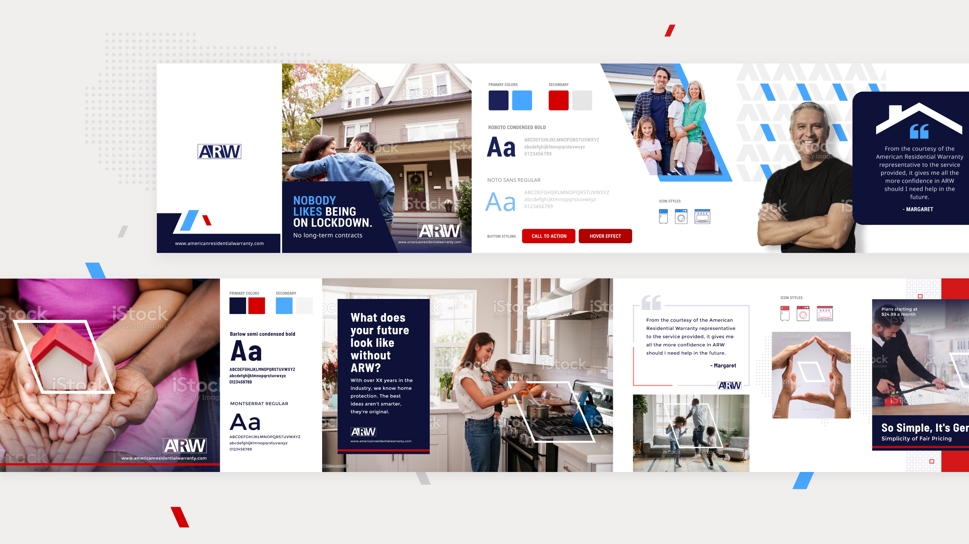
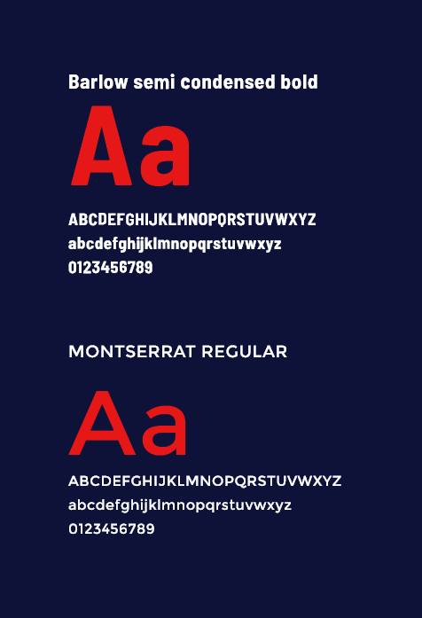
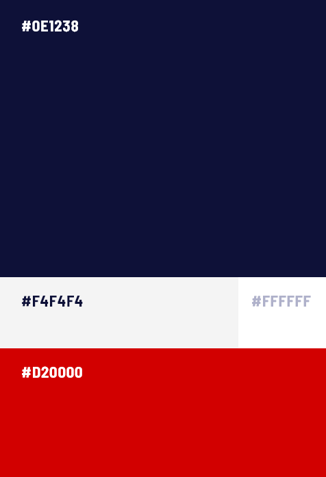
This is more like a re-branding with their existing logo which is without words. I decided to show stylescapes to understand the taste of the client. With these 2 stylescapes, I mostly tried to use the slant from their logo and exaggerating it throughtout as a design language and identity and for the other one, since its a brand which serves nationwide, used red and dark blue to psychologically relate to that.
UX Research
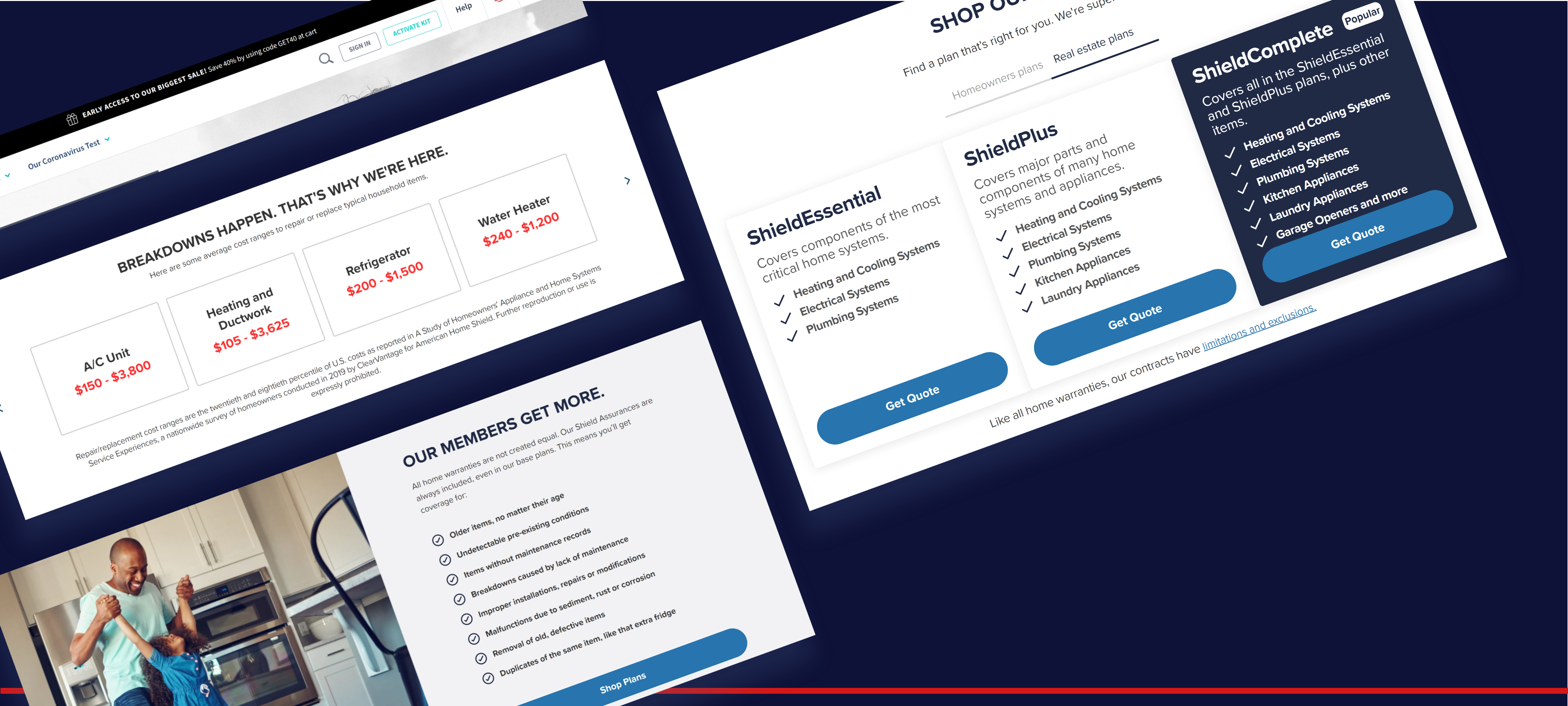
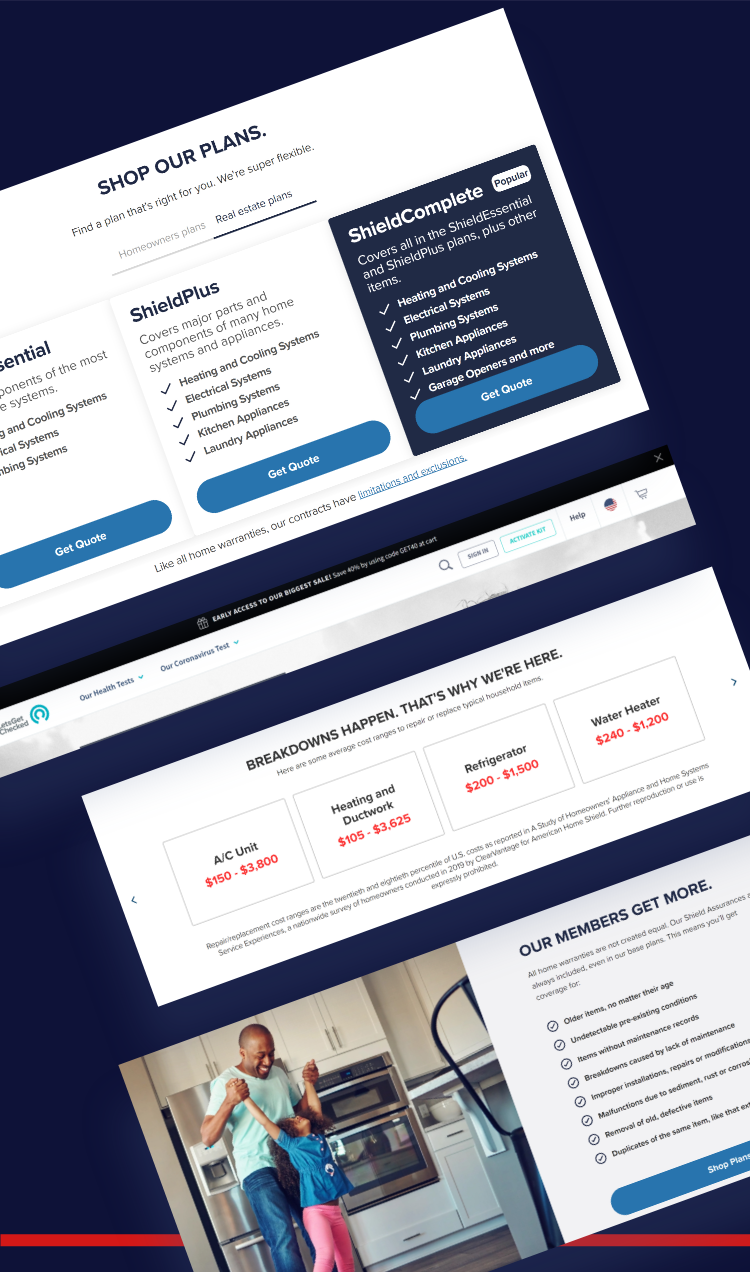
I did extensive research on the competitors site where I took some elements that the competitors used and tried to analyse the correlation with what ARW is trying to offer for the same. American Home shild is one of their biggest competitors. So I researched thoroughly on that and few other websites.
Wireframes
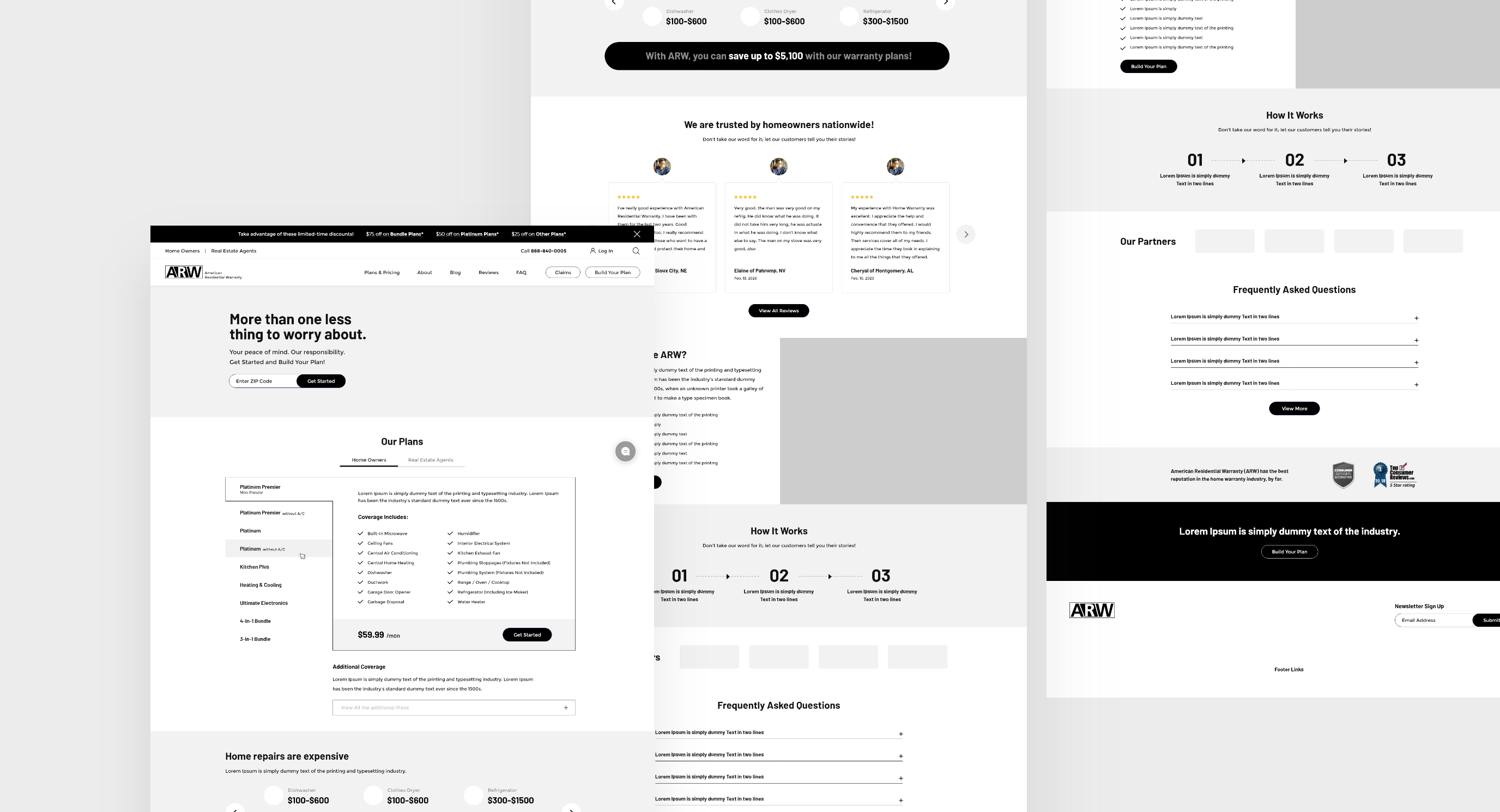
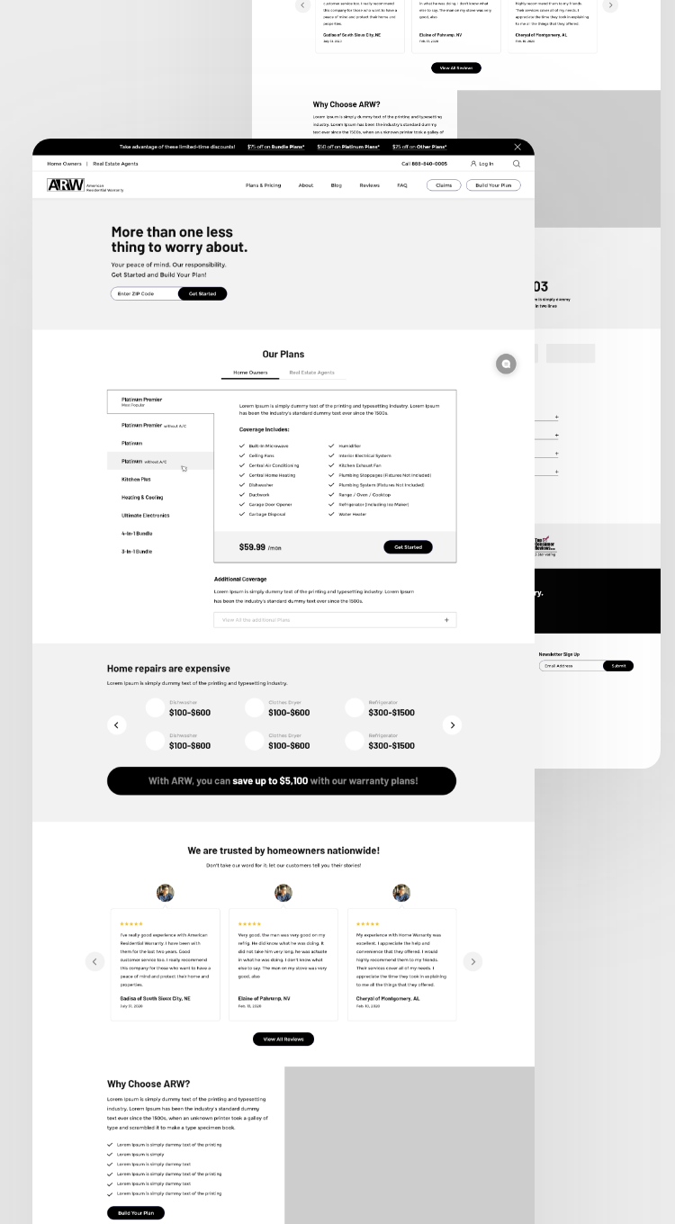
I did wireframe for the proposed homepage concept. The client especially really liked the “Our Plans” section approach as opposed to what they have currently which has a lots of clicks to view the information.
UI Interface
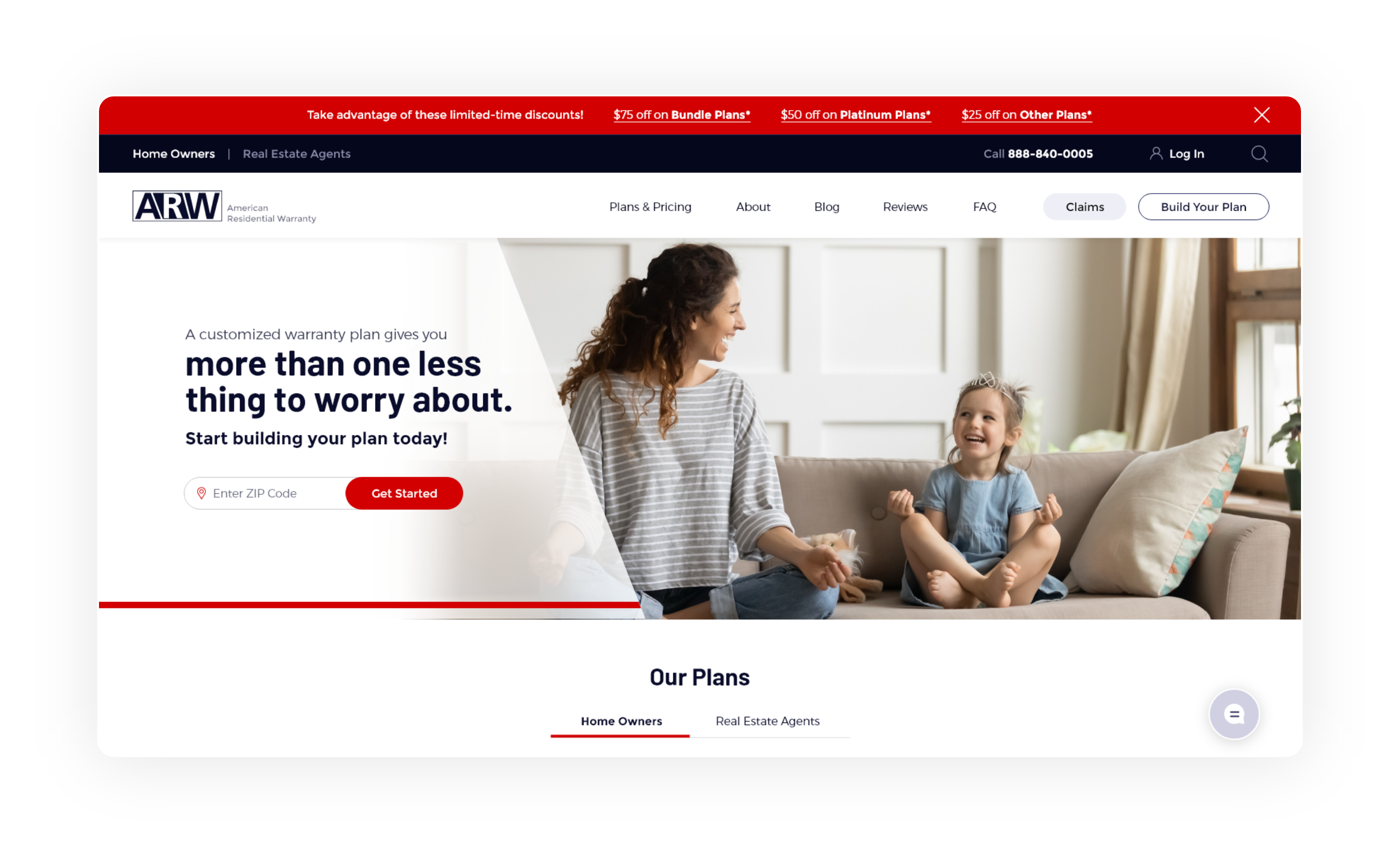
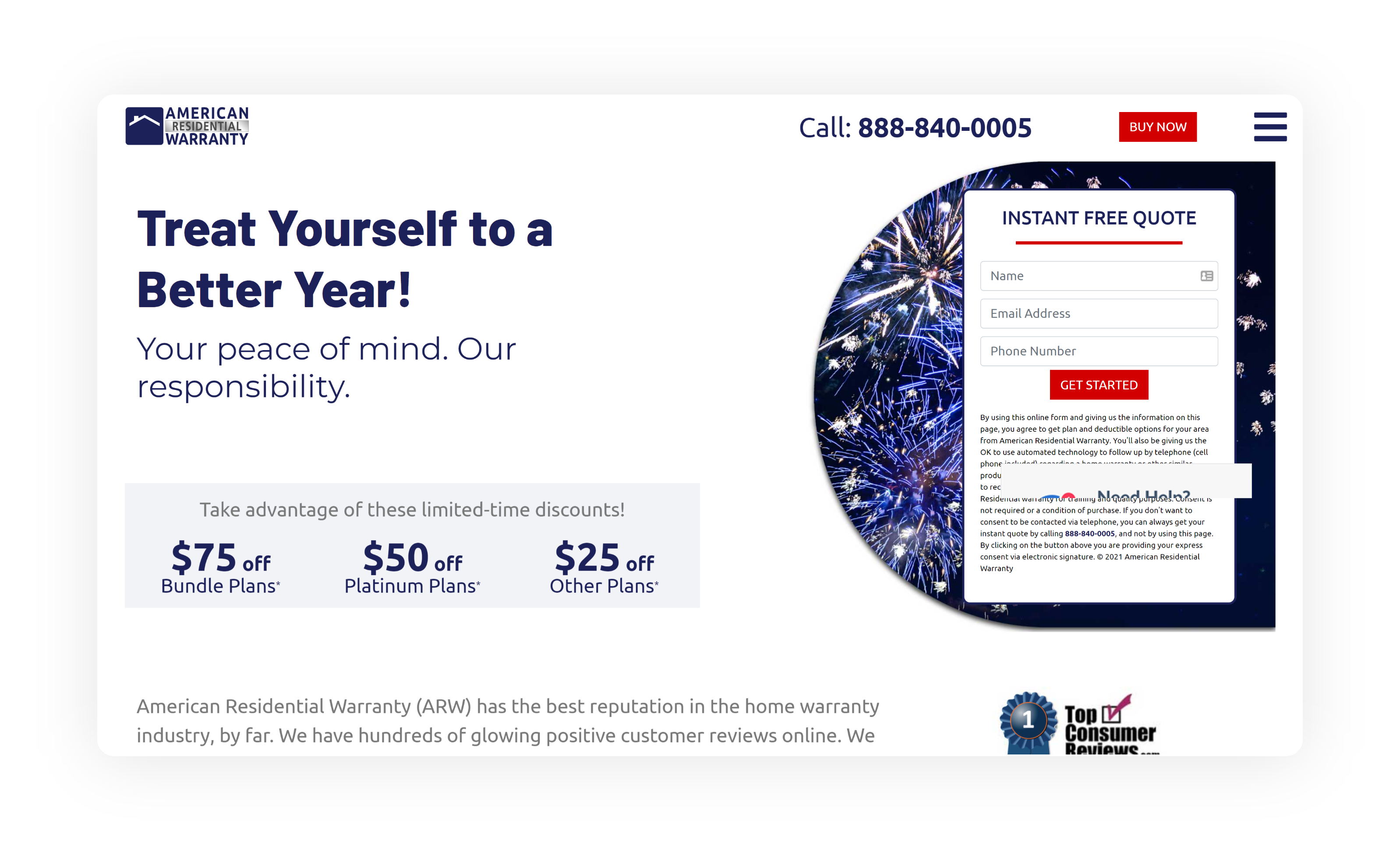
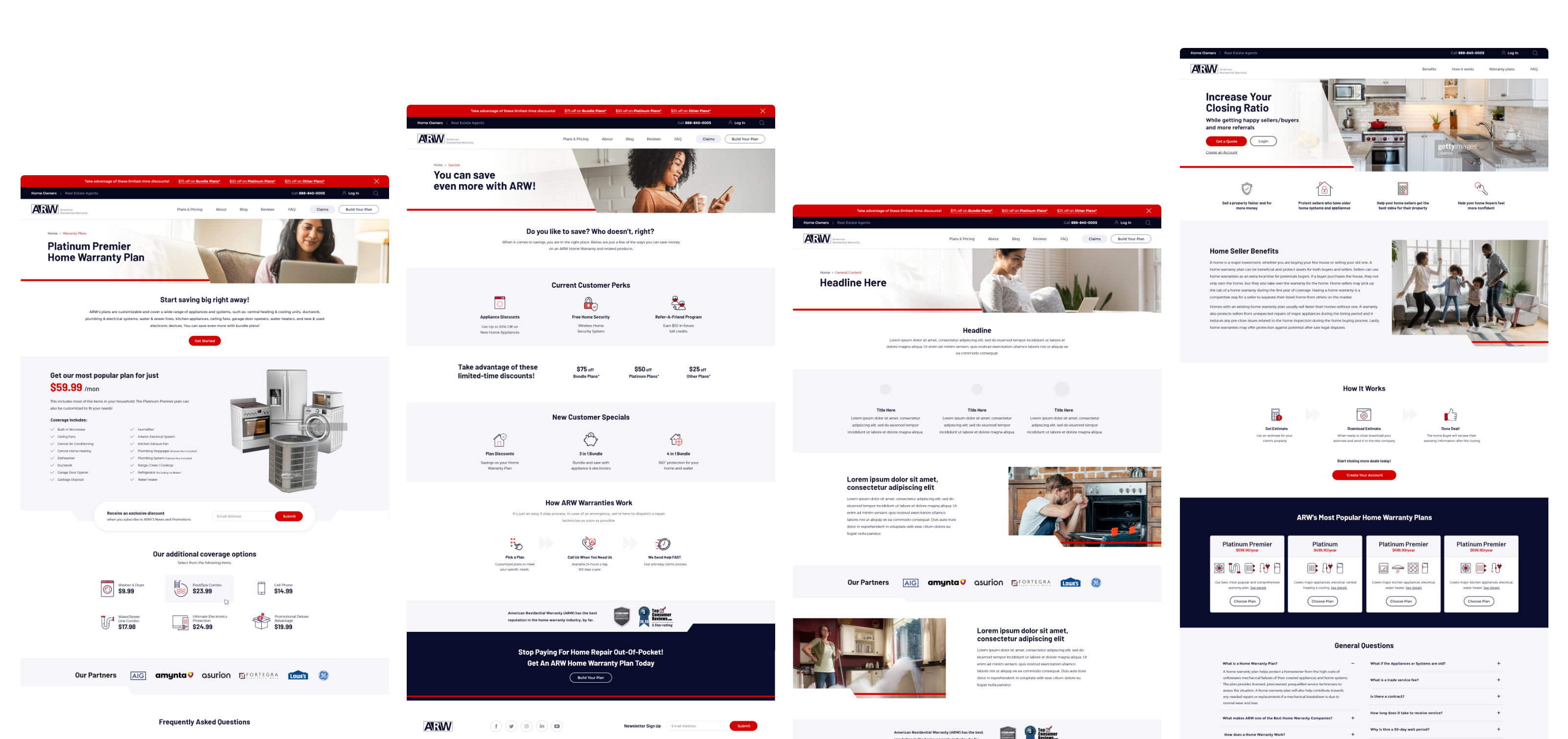
Below, you can see the clear difference between something branded and something that is not. As you can see, I have used the red line with some padding and the slant as their main design language. Based on the homepage, I did create a design system for my team to design the subpages & landing pages.

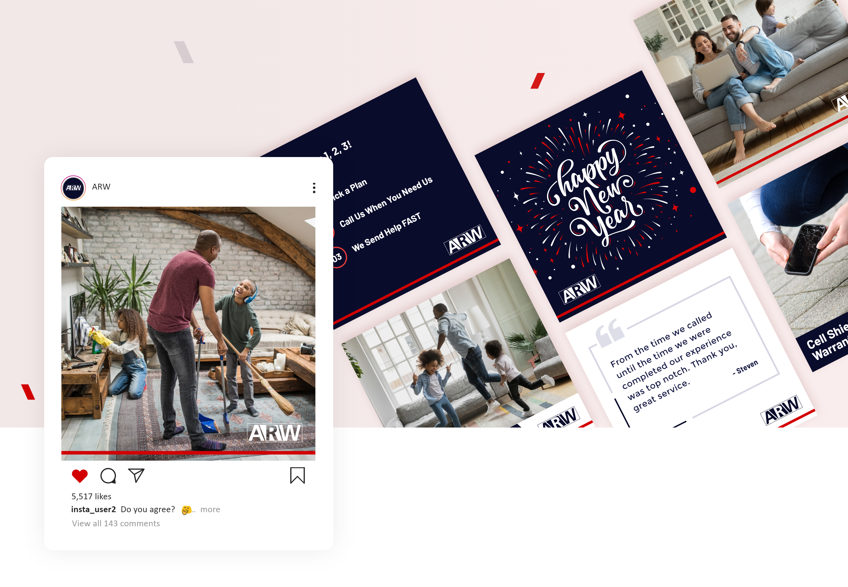
Social Ad Designs
I re-designed their social media ads and social posts designs to match the new visual look of the rest of the elements.

Photography & Styles
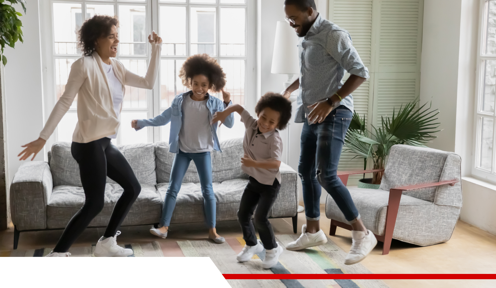
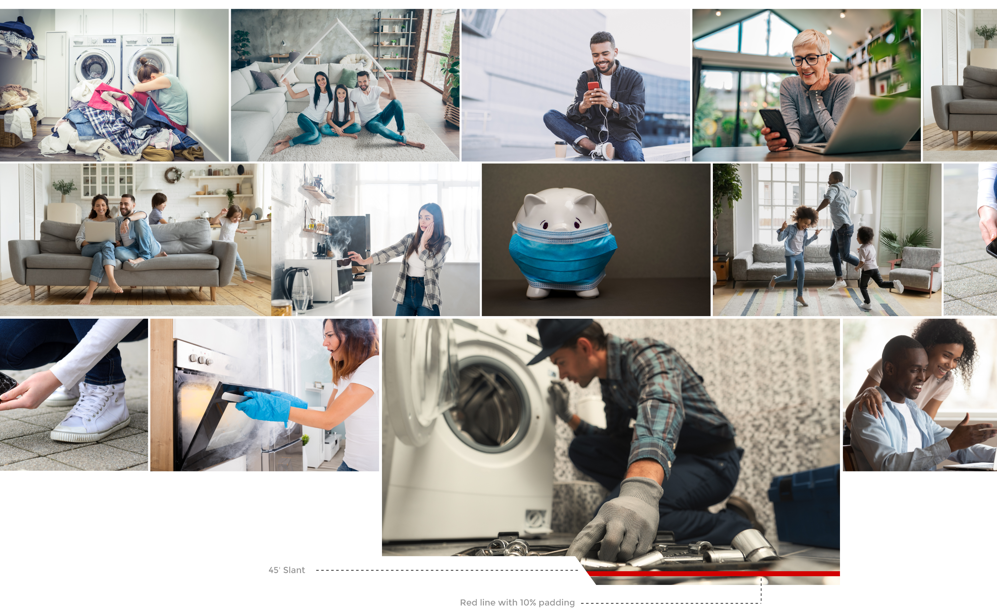
We are using a lot of lifestyle images which showcases the happy people mindset who got the appliances covered and sad/angry people showcasing how it is to have the appliances not getting covered. Also to add the uniqueness we slanted the 10% of the image and added the red line going across which acts as an identity to the brand.

Icon Styles
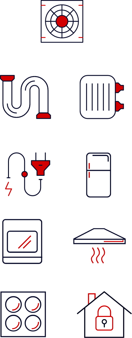
ARW already had these icons in their list already but we tweaked it to match the new look.
Interaction Design for Build Your Plan
For a lot of users, it might be difficult to choose the right plan for them. So we gave an option called “Build your plan” on the header which after clicking will ask questions intuitively and based on your answers, the plan will be recommended. And the estimate can be emailed to you for deciding later or proceed with pay to choose it. This eliminates doubts and hastles as a user in selecting the right plan for them.
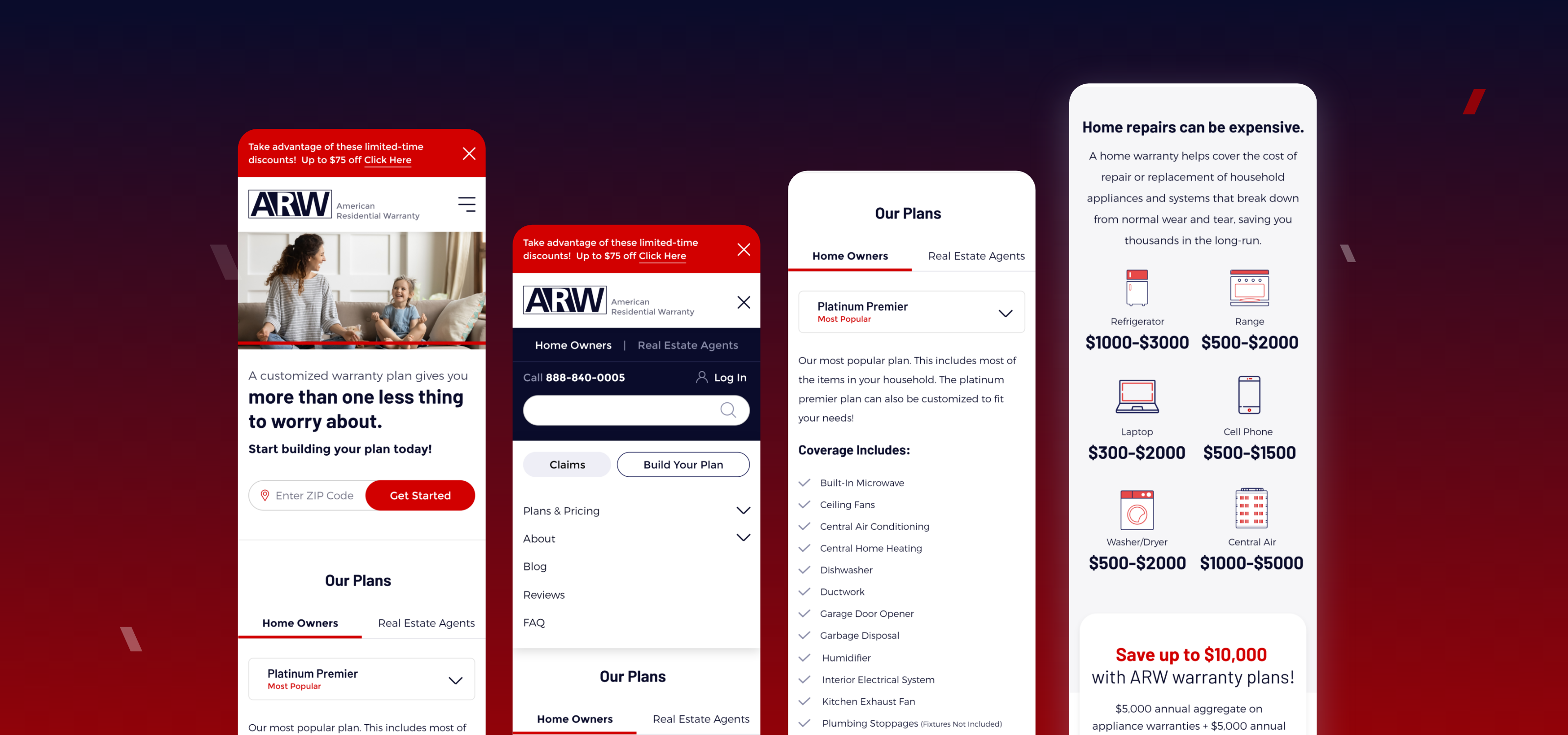
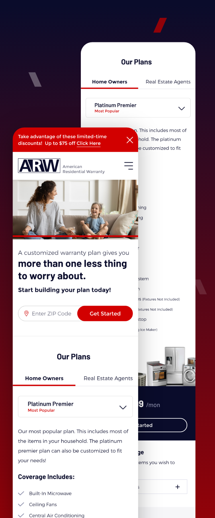
Responsive Mobile Design
More than 80% of the traffic comes from the mobile. Responsiveness has become more like a basic need now-a-days. We especially made the Our Plans section to work well for mobile since it works as a tab in desktop.
